Get a feel for your colors
Drop in a palette and see it come alive across illustrations, layouts, and type. Drag the chips to try different roles, switch backgrounds, and trust your eye before you commit.
Design with your palette, not around it.
This is how body copy feels on your background color. Long enough to judge readability, short enough to stay honest. If your eye relaxes here, the pairing works.
Try a famous palette
Judging a palette by feel
Specs tell you what a color is; they can't tell you how a combination feels. Tones exists for that gap. Seeing your palette applied to real shapes, scenes, and typography, on different backgrounds and in different role orders, surfaces the things a swatch strip hides: which color wants to lead, which pair vibrates, which combination goes muddy at small sizes.
A quick method
- Assign roles, not just colors. The first chip acts as your hero, the last as your base. Drag to audition each color in each role. Strong palettes usually have one obvious hero.
- Change the canvas. A palette born on white often falls apart on dark. Flip backgrounds early, before layouts calcify.
- Squint. The Stripes view approximates dominance at a glance; if the proportions feel wrong squinting, they'll feel wrong at scale.
- Read something. The Type view is the honesty test: if body copy is uncomfortable, no amount of decoration saves the pairing.
How colors work together
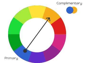
Complementary pairs sit opposite each other on the wheel. Explore relationships like these in Harmony.
Understanding tints, tones, and shades
A strong color system also needs variations of each color. Tints are lighter versions made by adding white, useful for backgrounds and disabled states. Tones add gray, producing muted versions for secondary elements. Shades add black, for text and high-contrast elements. Once a palette feels right here, build its variations in Harmony and verify accessibility in CoCo. Every palette in our Swatchy Brands Database shows both.